February 05, 2014
On 15 December 2013, “something“ happened in South Sudan that quickly began to spiral into a wider conflict. Prior research tells us that mass killings often occur on the heels of coup attempts and during civil wars, and at the time South Sudan ranked among the world’s countries at greatest risk of state-led mass killing.
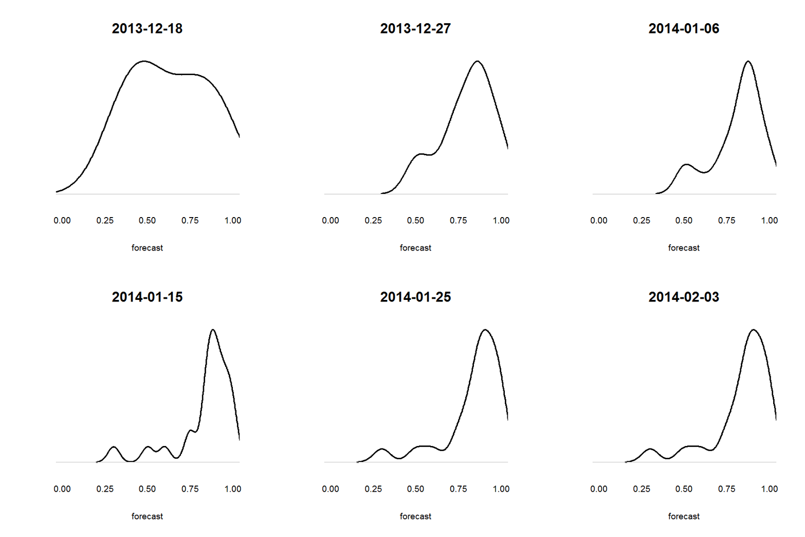
Motivated by these two facts, I promptly added a question about South Sudan to the opinion pool we’re running as part of a new atrocities early-warning system for the U.S. Holocaust Memorial Museum’s Center for the Prevention of Genocide (see this recent post for more on that). As it happened, we already had one question running about the possibility of a state-led mass killing in South Sudan targeting the Murle, but the spiraling conflict clearly implied a host of other risks. Posted on 18 December 2013, the new question asked, “Before 1 January 2015, will an episode of mass killing occur in South Sudan?” The criteria we gave our forecasters to understand what we mean by “mass killing” and how we would decide if one has happened appear under the Background Information header at the bottom of this post. Now, shown below is an animated sequence of kernel density plots of each day’s forecasts from all participants who’d chosen to answer this question. A kernel density plot is like a histogram, but with some nonparametric estimation thrown in to try to get at the distribution of a variable’s “true” values from the sample of observations we’ve got. If that sound like gibberish to you, just think of the peaks in the plots as clumps of experts who share similar beliefs about the likelihood of mass killing in South Sudan. The taller the peak, the bigger the clump. The farther right the peak, the more likely that clump thinks a mass killing is.

I see a couple of interesting patterns in those plots. The first is the rapid rightward shift in the distribution’s center of gravity. As the fighting escalated and reports of atrocities began to trickle in (see here for one much-discussed article from the time), many of our forecasters quickly became convinced that a mass killing would occur in South Sudan in the coming year, if one wasn’t occurring already. On 23 December—the date that aforementioned article appeared—the average forecast jumped to approximately 80 percent, and it hasn’t fallen below that level since. The second pattern that catches my eye is the appearance in January of a long, thin tail in the distribution that reaches into the lower ranges. That shift in the shape of the distribution coincides with stepped-up efforts by U.N. peacekeepers to stem the fighting and the start of direct talks between the warring parties. I can’t say for sure what motivated that shift, but it looks like our forecasters split in their response to those developments. While most remained convinced that a mass killing would occur or had already, a few forecasters were apparently more optimistic about the ability of those peacekeepers or talks or both to avert a full-blown mass killing.
A few weeks later, it’s still not clear which view is correct, although a forthcoming report from the U.N. Mission in South Sudan may soon shed more light on this question. I think this set of plots is interesting on its face for what it tells us about the urgent risk of mass atrocities in South Sudan. At the same time, I also hope this exercise demonstrates the potential to extract useful information from an opinion pool beyond a point-estimate forecast. We know from prior and ongoing research that those point estimates can be quite informative in their own right. Still, by looking at the distribution of participant’s forecasts on a particular question, we can glean something about the degree of uncertainty around an event of interest or concern. By looking for changes in that distribution over time, we can also get a more complete picture of how the group’s beliefs evolve in response to new information than a simple line plot of the average forecast could ever tell us. Look for more of this work as our early-warning system comes online, hopefully in the next few months.
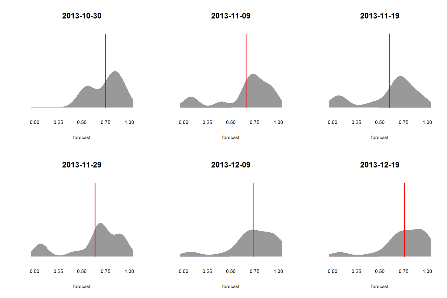
UPDATE (7 Feb): At the urging of Trey Causey, I tried making another version of this animation in which the area under the density plot is filled in. I also decided to add a vertical line to show each day’s average forecast, which is what we currently report as the single-best forecast at any given time. Here’s what that looks like, using data from a question on the risk of a mass killing occurring in the Central African Republic before 2015. We closed this question on 19 December 2013, when it became clear through reporting by Human Rights Watch and others that an episode of mass killing has occurred.

